
DESE Profiles Reimagined Website
Modernizing the 20-year-old platform behind school data for all 900,487 Massachusetts students, used by about 100,000 people every day
I'm leading the UX/UI redesign of DESE's School and District Profiles, the public site where parents, school leaders and policymakers look up how Massachusetts schools are doing. The data is deep and the stakes are high, so my job is making it easy to read for a parent checking on their kid's school while keeping it useful for the analyst who needs every number. I've worked side by side with developers and stakeholders from the first idea through the build.
Know Before You Draw
Before I sketched anything, I needed to know how Profiles actually worked. I ran focus groups with stakeholders and agency staff to collect acceptance criteria, what the site already did, and what frustrated people about it. Then I put together a competitive deck comparing how other states show their school data, so I could see where we were falling behind. Design only started after that. Jira was our single source of truth, so every ticket and acceptance criterion was ready when it reached the developers.
The Problem
Profiles was built in the early 2000s to display data, not to help people understand it. The data was great. The experience around it wasn't. Parents, policymakers and stakeholders had a hard time finding their way, the hierarchy changed from page to page, and the most useful insights were buried in dense tables. People expect more from a website now, and Profiles needed a structure that kept all that data while making it clear and accessible.


The Inspiration
The big picture came from Wikipedia's recent redesign. It's an old site holding a massive amount of information, and they refreshed it without losing what makes it useful: better hierarchy, easier reading, a nicer feel, same depth. That's what I wanted for Profiles. I also looked at smaller school websites that feel focused and community driven. Pairing that warmth with Wikipedia's structure let me design Profiles as a full statewide data hub that still feels human.


The Solution (Out with the Old, In with the New)
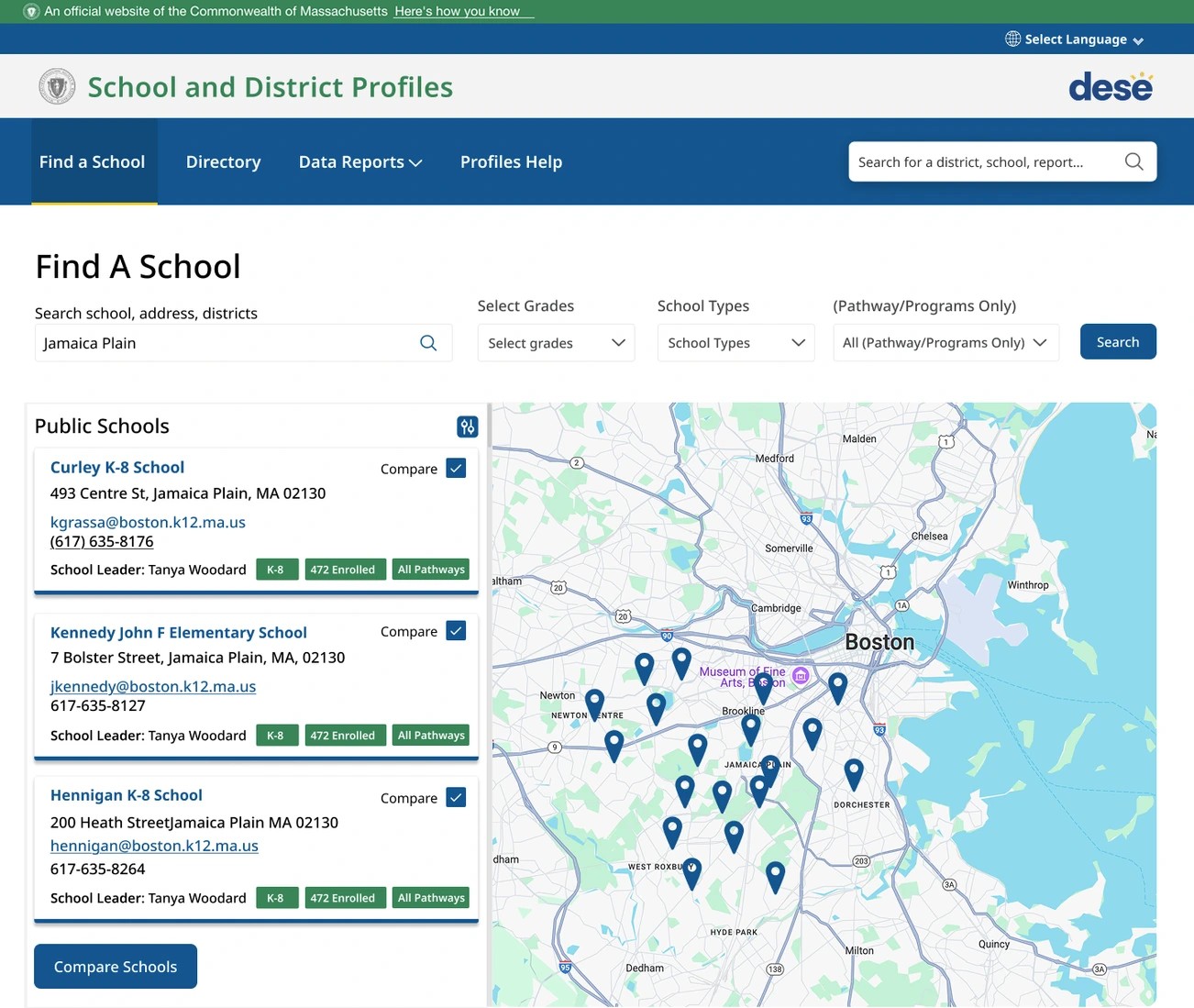
I rebuilt it around progressive disclosure. Casual visitors get simple ways in, power users get deeper comparison and filtering tools, and one consistent visual hierarchy holds it together for every level of data experience.
The Impact
Profiles is the front door to school and district data for all 900,487 students in Massachusetts, and about 100,000 people use it every day: parents, school leaders, policymakers and researchers. Getting it right means the data makes sense to every one of them, from a parent comparing schools to an analyst digging into trends.
Coming soon